
@rdlabo/ionic-theme-ios26
A CSS/JS theme library that applies iOS26 design system to Ionic applications.
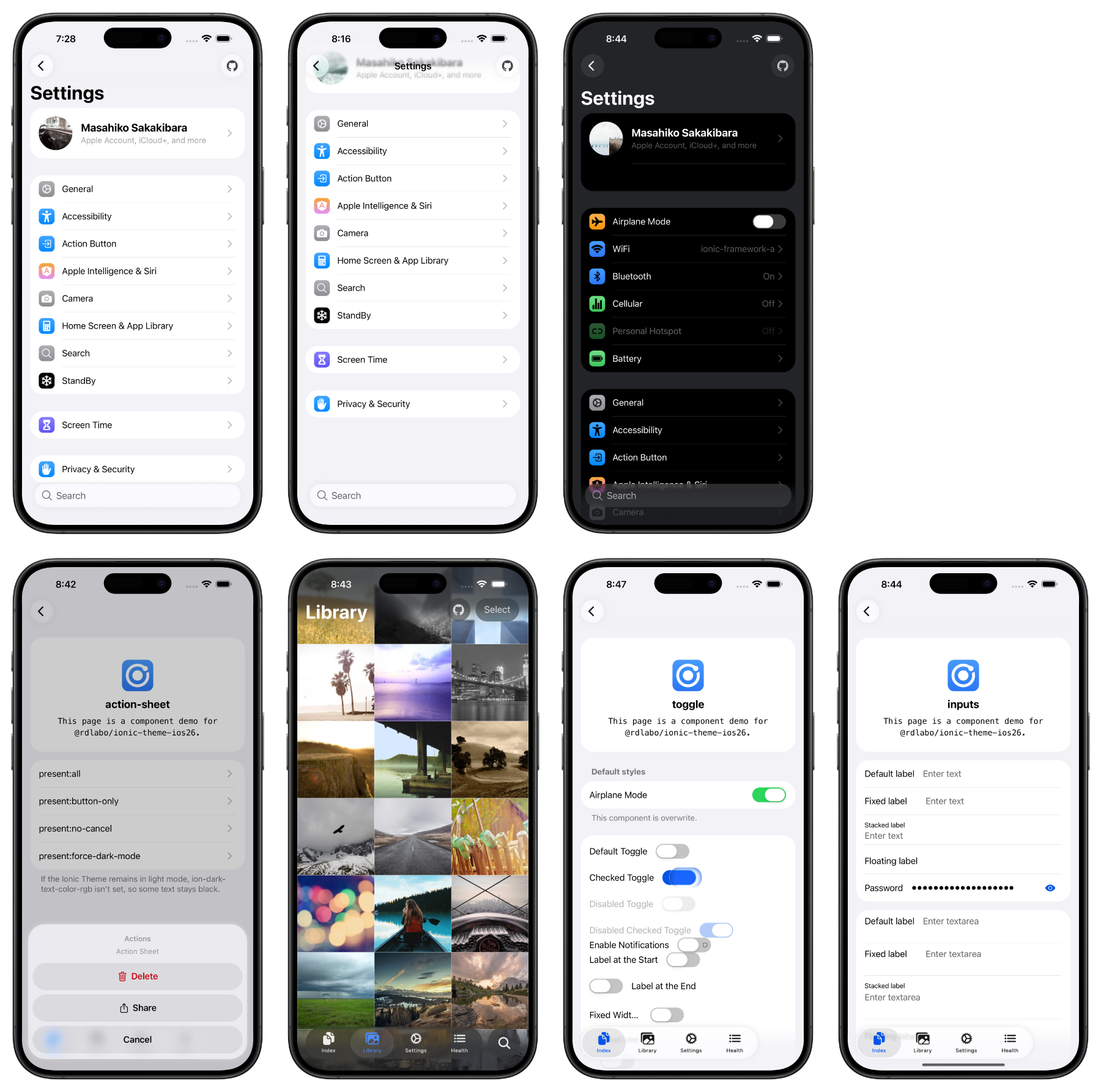
DEMO is here: https://ionic-theme-ios26.netlify.app/
Overview
This library provides CSS/JS files that bring the iOS26 design system to Ionic applications. It updates the look and feel of Ionic components to match the latest iOS26 design guidelines.
I'm also working on the Android Design (Material Design 3) theme. Be sure to catch up!
💖 Support This Project
Enjoying this library? Your support helps keep it alive and growing!
Sponsoring means you directly contribute to new features, improvements, and maintenance.
Setup
This is a CSS theme for extending your Ionic project. It does not work on its own, so use it together with the Ionic Framework.
npm install @rdlabo/ionic-theme-ios26
Note: If you use @ionic/core@ < 8.8.1, use @rdlabo/ionic-theme-ios26@2.2.1.
And import the theme in your project's main CSS file (e.g., src/styles.scss).
@import '@rdlabo/ionic-theme-ios26/dist/css/default-variables.css';
@import '@rdlabo/ionic-theme-ios26/dist/css/ionic-theme-ios26.css';

/**
 * This file is to eliminate the impact of class name changes for iOS26.
 * For example, `ion-buttons ion-button[fill=default]` is not normally implemented, but may be required for iOS26.
 * This file is to eliminate such effects.
 * Note: This is not include `@rdlabo/ionic-theme-md3`
 */
@import '@rdlabo/ionic-theme-ios26/dist/css/md-remove-ios-class-effect.css';

/**
 * If you will use the design of ion-item-group with ion-list on Android as well, import it.
 * More info: https://github.com/rdlabo-dev/ionic-theme-ios26/blob/v2.3.2/USING_ION_ITEM_GROUP.md
 * Note: This is include `@rdlabo/ionic-theme-md3`
 * @import '@rdlabo/ionic-theme-ios26/dist/css/md-ion-list-inset.css';
 */

/*
 * Support Dark Mode
 * We support Ionic Dark Mode. More information is here: https://ionicframework.com/docs/theming/dark-mode
 * use Always:    @import '@rdlabo/ionic-theme-ios26/dist/css/ionic-theme-ios26-dark-always.css'
 * use System:    @import '@rdlabo/ionic-theme-ios26/dist/css/ionic-theme-ios26-dark-system.css'
 * use CSS Class: @import '@rdlabo/ionic-theme-ios26/dist/css/ionic-theme-ios26-dark-class.css'
 */
Next, configure the animations for iOS 26. Add the following to your Ionic configuration options.
import { isPlatform } from '@ionic/core'; // or @ionic/angular/standalone, @ionic/react, @ionic/vue
import { iosTransitionAnimation, popoverEnterAnimation, popoverLeaveAnimation } from '@rdlabo/ionic-theme-ios26';

// Angular
provideIonicAngular({
    ...
    navAnimation: isPlatform('ios') ? iosTransitionAnimation: undefined,
    popoverEnter: isPlatform('ios') ? popoverEnterAnimation: undefined,
    popoverLeave: isPlatform('ios') ? popoverLeaveAnimation: undefined,
});

// React
setupIonicReact({
    ...
    navAnimation: isPlatform('ios') ? iosTransitionAnimation: undefined,
    popoverEnter: isPlatform('ios') ? popoverEnterAnimation: undefined,
    popoverLeave: isPlatform('ios') ? popoverLeaveAnimation: undefined,
});

// Vue
createApp(App)
    .use(IonicVue, {
        ...
        navAnimation: isPlatform('ios') ? iosTransitionAnimation: undefined,
        popoverEnter: isPlatform('ios') ? popoverEnterAnimation: undefined,
        popoverLeave: isPlatform('ios') ? popoverLeaveAnimation: undefined,
})
Important Notes
Using ion-item-group
Under specific conditions, you need to use ion-item-group.
  <ion-list inset=true>
    <ion-list-header><ion-label>Label</ion-label></ion-list-header>
+   <ion-item-group>
      <ion-item>...</ion-item>
      <ion-item>...</ion-item>
+   </ion-item-group>
  </ion-list>
For details, please refer to USING_ION_ITEM_GROUP.md.
Features
CSS Variables
To customize the library's default styles to match your design, several CSS variables are provided. See this file for details: https://github.com/rdlabo-dev/ionic-theme-ios26/blob/v2.3.2/src/styles/default-variables.scss
.ios26-disabled Class
Add the .ios26-disabled class to disable the iOS26 theme on specific components.
<!-- iOS26 theme applied -->
<ion-button>iOS26 Design</ion-button>

<!-- Standard Ionic iOS styling -->
<ion-button class="ios26-disabled">Standard Ionic Design</ion-button>
Liquid Glass Mixin
Import the SCSS files from the main package to use the liquid glass mixin.
@use '@rdlabo/ionic-theme-ios26/src/styles/utils/api.scss';

ion-textarea label.textarea-wrapper {
  @include api.glass-background;
}
Additional Design
To achieve higher fidelity to iOS26 design, you can implement additional design provided by this library. For more details, please visit:
https://ionic-theme-ios26.netlify.app/main/docs
Experimental Animation
This feature is experimental. The library can be used without this feature.
Sheet of Glass with ion-tab-button / ion-segment-button
By registering ion-tab-bar / ion-segment, you can display animation effects on ion-tab-button / ion-segment-button
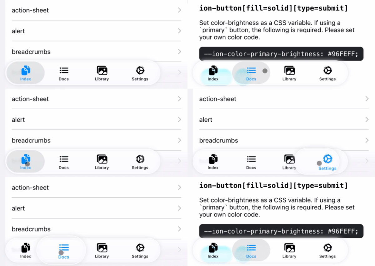
import { registerTabBarEffect, registerSegmentEffect } from '@rdlabo/ionic-theme-ios26';

/**
 * Register DOM elements. Effects are applied using Ionic Gesture and Ionic Animation.
 */
const tabBar = document.querySelector<HTMLElement>('ion-tab-bar');
const segment = document.querySelector<HTMLElement>('ion-segment');
const registeredTabBarEffect = tabBar ? registerTabBarEffect(tabBar) : undefined;
const registeredSegmentEffect = segment ? registerSegmentEffect(segment) : undefined;

const destroy = () => {
  /**
   * If the registered DOM element is removed (e.g., due to page navigation),
   * make sure to destroy the gesture and animation. This will also remove the event listeners.
   * You can re-register them if needed.
   */
  registeredTabBarEffect?.destroy();
  registeredSegmentEffect?.destroy();
}
TabBarSearchable: Searchable with ion-tab-bar and ion-fab-button
Enable Searchable for the DOM structure with the specified markup inner ion-tabs.
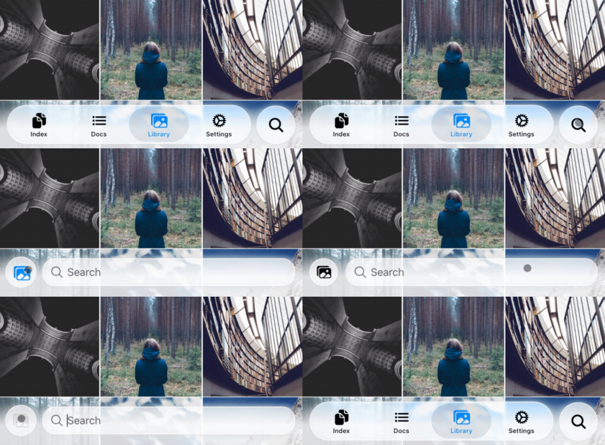
<ion-content>...</ion-content>
<ion-fab vertical="bottom" horizontal="end" slot="fixed">
  <ion-fab-button (click)="present($event)">
    <ion-icon name="search"></ion-icon>
  </ion-fab-button>
</ion-fab>
<ion-footer [translucent]="true">
  <ion-toolbar>
    <ion-buttons slot="start">
      <!-- ion-icon name is set dynamically by the animation -->
      <ion-button fill="default"><ion-icon slot="icon-only"></ion-icon>
      </ion-button>
    </ion-buttons>
    <!-- User set `ionChange` or other events. -->
    <ion-searchbar (ionChange)="example($event)"></ion-searchbar>
  </ion-toolbar>
</ion-footer>
import { attachTabBarSearchable, TabBarSearchableType } from '@rdlabo/ionic-theme-ios26';
import type { TabBarSearchableFunction } from '@rdlabo/ionic-theme-ios26';

let searchableFun: TabBarSearchableFunction | undefined;
const initialize = () => {
  // attachTabBarSearchable has state. You should initialize per page.
  const tabBar = document.querySelector<HTMLElement>('ion-tab-bar');
  const fabButton = document.querySelector<HTMLElement>('ion-fab-button');
  const footer = document.querySelector<HTMLElement>('ion-footer');
  if (!tabBar || !fabButton || !footer) {
    return;
  }
  searchableFun = attachTabBarSearchable(tabBar, fabButton, footer);
}

const present = (event: Event) => {
  searchableFun!(event, TabBarSearchableType.Enter);
}

const dismiss = (event: Event) => {
  searchableFun!(event, TabBarSearchableType.Leave);
}
Additional Information
How to prevent loading a theme file on iOS 18
If you want to load a theme file only when the user's device is running iOS 26 (and let users on iOS 18 use the default Ionic iOS theme), you can achieve this by adding a supports-condition to your import.
@import '@rdlabo/ionic-theme-ios26/dist/css/default-variables.css' supports(text-wrap: pretty);
@import '@rdlabo/ionic-theme-ios26/dist/css/ionic-theme-ios26.css' supports(text-wrap: pretty);
@import '@rdlabo/ionic-theme-ios26/dist/css/md-remove-ios-class-effect.css' supports(text-wrap: pretty);
@import '@rdlabo/ionic-theme-ios26/dist/css/md-ion-list-inset.css' supports(text-wrap: pretty);
Migration Support
For gradual migration, you can selectively apply the iOS26 theme by importing individual components instead of the full theme file.
@import '@rdlabo/ionic-theme-ios26/dist/css/utils/translucent';
@import '@rdlabo/ionic-theme-ios26/dist/css/components/ion-action-sheet';
@import '@rdlabo/ionic-theme-ios26/dist/css/components/ion-alert';
@import '@rdlabo/ionic-theme-ios26/dist/css/components/ion-button';
...
Dark Mode with Individual Components
When importing individual components with dark mode support, use SCSS instead of CSS. This is because the selectors differ between Always, System, and Class modes.
Note: Currently, only
ion-buttonhas separate dark mode styling applied.
Always (Always Dark Mode):
@use '@rdlabo/ionic-theme-ios26/src/styles/utils/theme-dark';

:root {
    @include theme-dark.default-variables;
}
@include theme-dark.ion-button;
@include theme-dark.ion-fab;
@include theme-dark.ion-tabs;
@include theme-dark.ion-segment;
System (Follow System Settings):
@use '@rdlabo/ionic-theme-ios26/src/styles/utils/theme-dark';

@media (prefers-color-scheme: dark) {
    :root {
        @include theme-dark.default-variables;
    }
    @include theme-dark.ion-button;
    @include theme-dark.ion-fab;
    @include theme-dark.ion-tabs;
    @include theme-dark.ion-segment;
}
Class (Toggle with CSS Class):
@use '@rdlabo/ionic-theme-ios26/src/styles/utils/theme-dark';

.ion-palette-dark {
    @include theme-dark.default-variables;
    @include theme-dark.ion-button;
    @include theme-dark.ion-fab;
    @include theme-dark.ion-tabs;
    @include theme-dark.ion-segment;
}
Development & Testing
Demo Application
The demo/ directory contains an Angular application for testing and demonstrating the theme. To run the demo:
cd demo
npm install
npm start
Visual Regression Testing
We use Playwright for visual regression testing to ensure consistent styling across all components. The test suite automatically captures screenshots of all routes in both light and dark modes.
Running Tests
cd demo

# Run all E2E tests
npm run test:e2e

# Run tests in UI mode (interactive)
npm run test:e2e:ui

# Debug tests
npm run test:e2e:debug

# Update baseline screenshots (when intentionally changing UI)
npm run test:e2e:update