
Animation
These gesture and animation helpers are production-ready and optional. The theme works without them.
Sheet of Glass with ion-tab-button / ion-segment-button
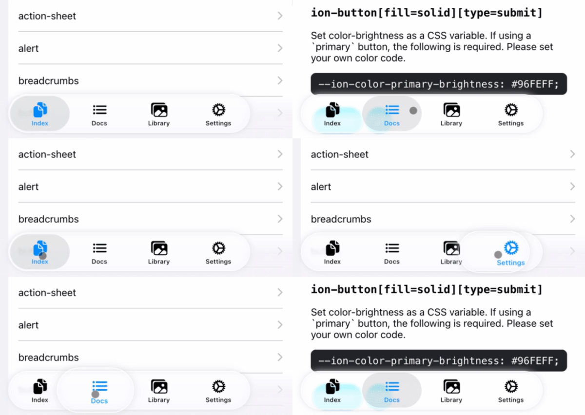
Register an ion-tab-bar or ion-segment element to add a moving selection effect to its buttons.
registerTabBarEffect respects prefers-reduced-motion, including changes while the page is open. Reduced motion removes the moving lens and tab scaling while preserving standard Ionic selection. Turning it off restores the optional effect until the registration is destroyed.
registerSegmentEffect adds only a visual layer; Ionic still owns selection, dragging, keyboard handling, and events. An unselected segment starts its lens movement on release, while a selected segment expands in place, including on short taps. The motion follows iOS 27 presentation-layer measurements. Reduced motion skips this optional effect; native glass refraction is approximated with CSS.
import { registerTabBarEffect, registerSegmentEffect } from '@rdlabo/ionic-theme-ios27';

/**
 * Register initialized Ionic DOM elements.
 */
const tabBar = document.querySelector<HTMLElement>('ion-tab-bar');
const segment = document.querySelector<HTMLElement>('ion-segment');
const registeredTabBarEffect = tabBar ? registerTabBarEffect(tabBar) : undefined;
const registeredSegmentEffect = segment ? registerSegmentEffect(segment) : undefined;

const destroy = () => {
  /**
   * If the registered DOM element is removed (e.g., due to page navigation),
   * make sure to destroy the gesture and animation. This will also remove the event listeners.
   * You can re-register them if needed.
   */
  registeredTabBarEffect?.destroy();
  registeredSegmentEffect?.destroy();
};
Searchbar cancel icon
Ionic 8 and 9 render cancelButtonIcon only in Material Design mode. Register a searchbar to use that same property in iOS mode. Without this optional helper, the theme keeps Ionic's cancel text button.
This is a temporary rendering shim, scheduled for removal once the supported Ionic versions render cancelButtonIcon in the iOS DOM. It skips insertion when an icon is already present. It does not change keyboard handling, focus, accessibility attributes on the button, or cancel/clear behavior; these remain Ionic's responsibility. The CSS design and animations are independent of the helper and also apply to an icon rendered by Ionic itself.
import { supportSeachbarCancelButtonIcon } from '@rdlabo/ionic-theme-ios27';
import { closeOutline } from 'ionicons/icons';

const searchbar = document.querySelector<HTMLIonSearchbarElement>('ion-searchbar')!;
searchbar.animated = true;
searchbar.showCancelButton = 'focus'; // 'always' and 'never' also work
searchbar.cancelButtonIcon = closeOutline;
searchbar.clearIcon = closeOutline;
searchbar.cancelButtonText = 'Close search'; // accessible name of the icon button
const effect = supportSeachbarCancelButtonIcon(searchbar);

// After changing cancelButtonIcon as a JavaScript property, call effect.refresh().
// When the component/page is destroyed:
// effect.destroy();
Register after the Ionic element has initialized (for example, Angular's ngAfterViewInit). The helper preserves Ionic's button and event handlers, and destroy() restores its text content. It does not apply to MD mode, searchbar-classic, ios-theme-disabled, or ios26-disabled searchbars. The CSS animation follows animated and respects prefers-reduced-motion. Standard searchbar CSS variables such as --background, --box-shadow, --border-radius, and --cancel-button-color remain available.
The clear button shares the 44px glass design and appears beside the input. It uses Ionic's clearIcon, showClearButton, and --clear-button-color; clearing retains input focus, while cancel ends the search. Clear and cancel can be displayed together. Set clearIcon and cancelButtonIcon to the same icon to give them the same appearance.
Both external glass buttons use the iOS 27 cancel button's centered press spring, scaled down to fit the available 8px padding without clipping the border: 44px at rest, 57.2px held, with an approximately 58.26px overshoot (native: 60px held and 61.29px peak). Press and release curves follow UIKit presentation-layer measurements (iPhone 18 Pro simulator); reduced motion disables scaling. This shared external clear design intentionally differs from UIKit's small, non-expanding clear button inside the text field. Ionic supplies the icons, so glyph pixels are not identical to SF Symbols.
While held, the glass background becomes opaque and the icon opacity is 0.55, preserving its configured color. Use --background-activated to customize the pressed background independently of --background.
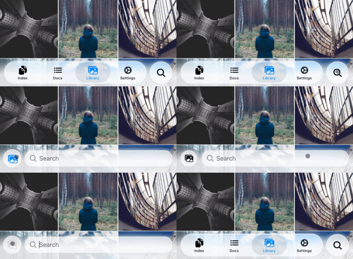
TabBarSearchable: Searchable with ion-tab-bar and ion-fab-button
Use the following structure inside ion-tabs to animate a search button into a search toolbar.
<ion-content>...</ion-content>
<ion-fab vertical="bottom" horizontal="end" slot="fixed">
  <ion-fab-button (click)="present($event)">
    <ion-icon name="search"></ion-icon>
  </ion-fab-button>
</ion-fab>
<ion-footer [translucent]="true">
  <ion-toolbar>
    <ion-buttons slot="start">
      <!-- ion-icon name is set dynamically by the animation -->
      <ion-button fill="default"><ion-icon slot="icon-only"></ion-icon> </ion-button>
    </ion-buttons>
    <!-- User set `ionChange` or other events. -->
    <ion-searchbar (ionChange)="example($event)"></ion-searchbar>
  </ion-toolbar>
</ion-footer>
import { attachTabBarSearchable, TabBarSearchableType } from '@rdlabo/ionic-theme-ios27';
import type { TabBarSearchableFunction } from '@rdlabo/ionic-theme-ios27';

let searchableFun: TabBarSearchableFunction | undefined;
const initialize = () => {
  // attachTabBarSearchable has state. You should initialize per page.
  const tabBar = document.querySelector<HTMLElement>('ion-tab-bar');
  const fabButton = document.querySelector<HTMLElement>('ion-fab-button');
  const footer = document.querySelector<HTMLElement>('ion-footer');
  if (!tabBar || !fabButton || !footer) {
    return;
  }
  searchableFun = attachTabBarSearchable(tabBar, fabButton, footer);
};

const present = (event: Event) => {
  searchableFun!(event, TabBarSearchableType.Enter);
};

const dismiss = (event: Event) => {
  searchableFun!(event, TabBarSearchableType.Leave);
};